
Earth Essence Table Runner
This post may contain affiliate links which won’t change your price but will share a commission.
Earth Essence Table Runner
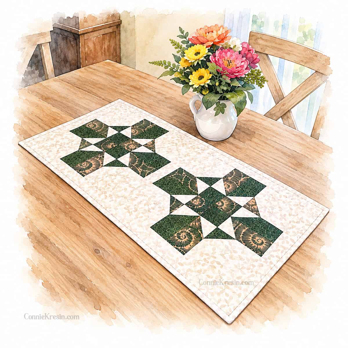
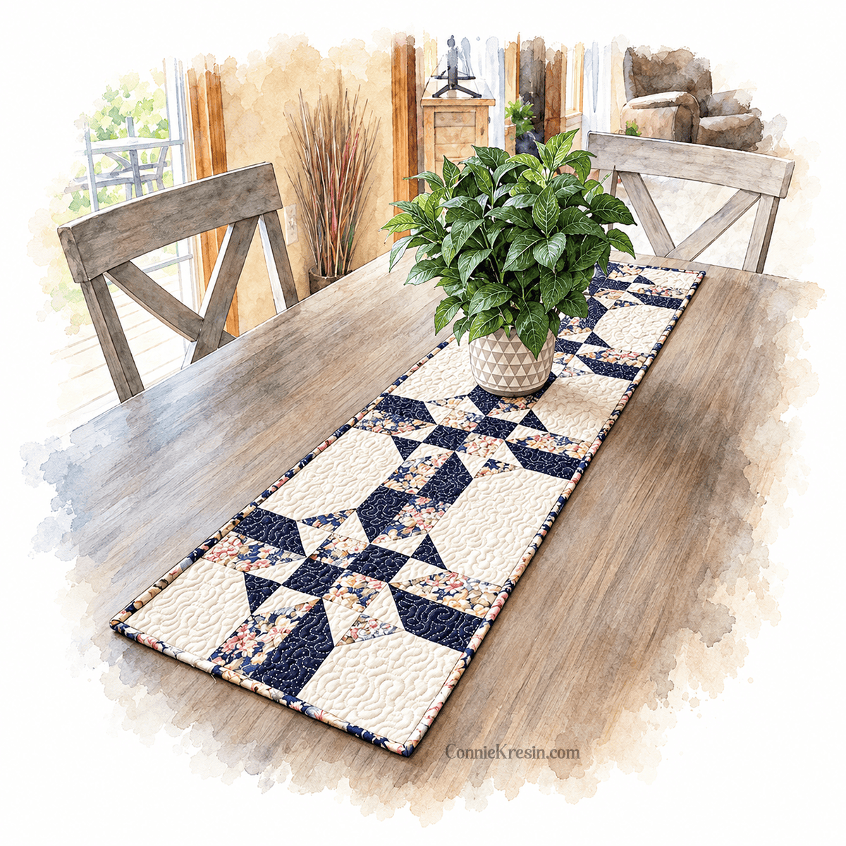
I finished quilting my Earth Essence table runner last night and this morning I added the binding to it. If I’m not quilting, I am “playing with graphics. I love the watercolor look of my table runner.
The Actual Runner
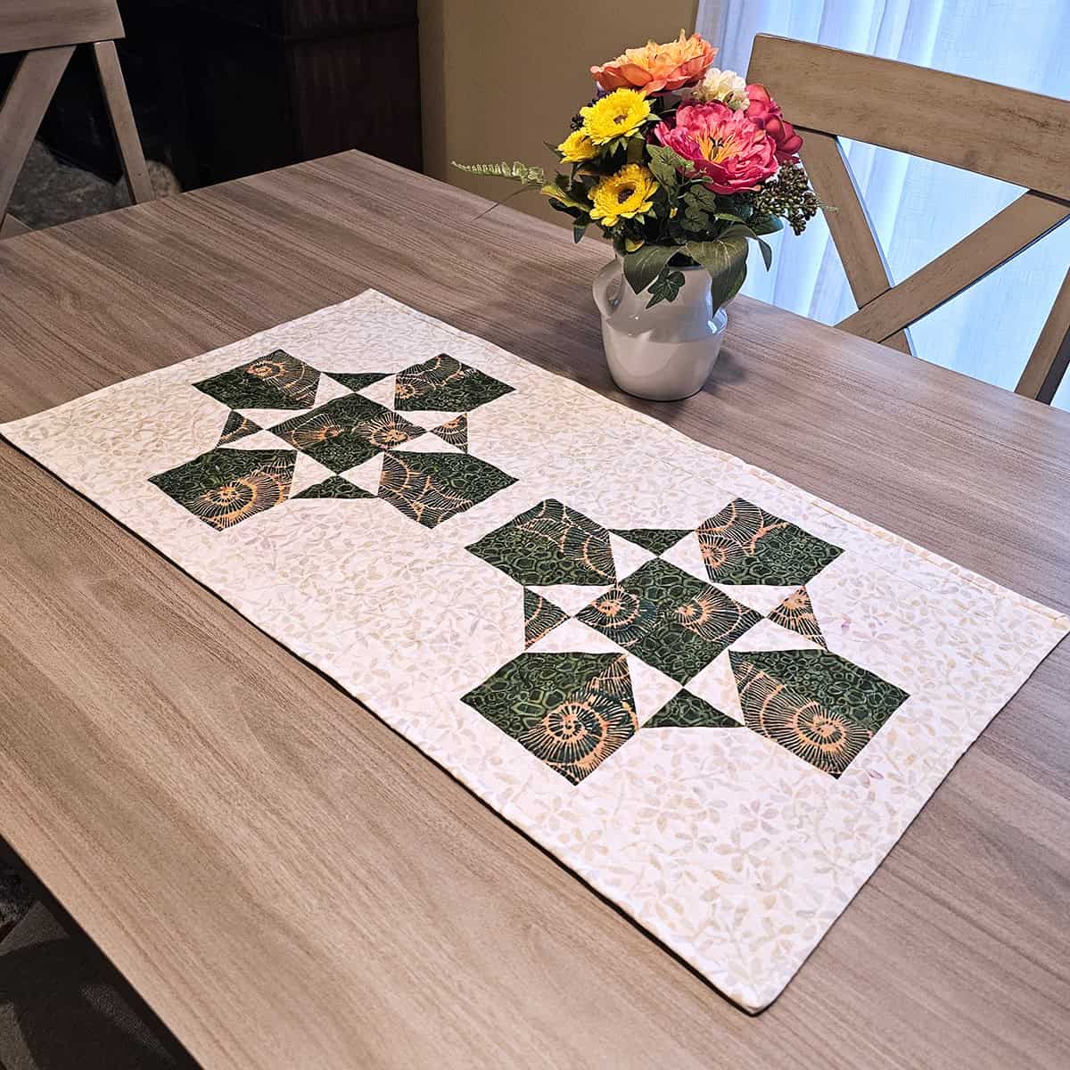
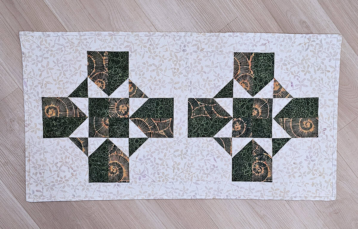
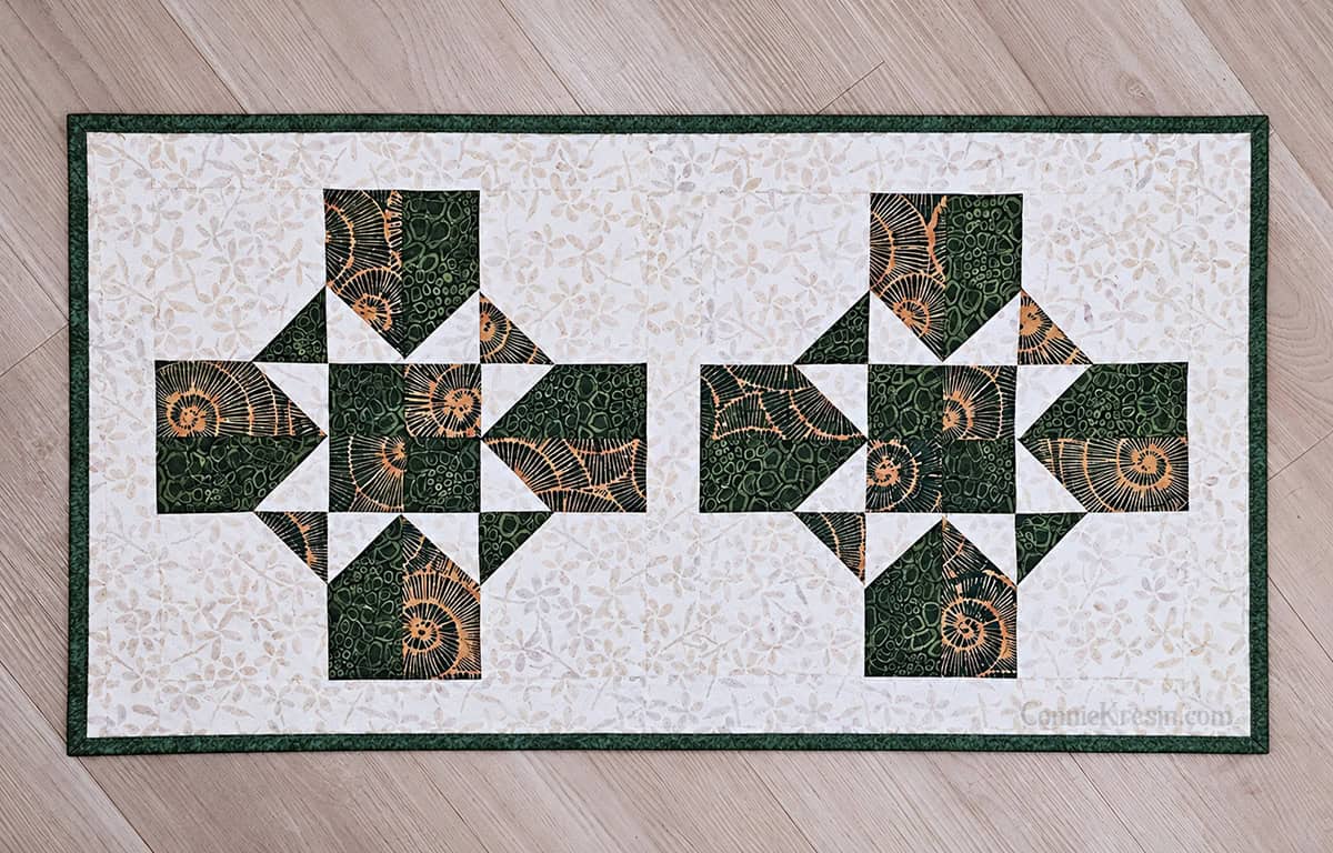
Here is the real table runner, I ended up putting a 2-inch sashing between the 2 quilt blocks and then added a 2-inch border. As you can see, I used the background fabric for the binding. I’m not too crazy about that and wish I had gone with one of the green batiks.
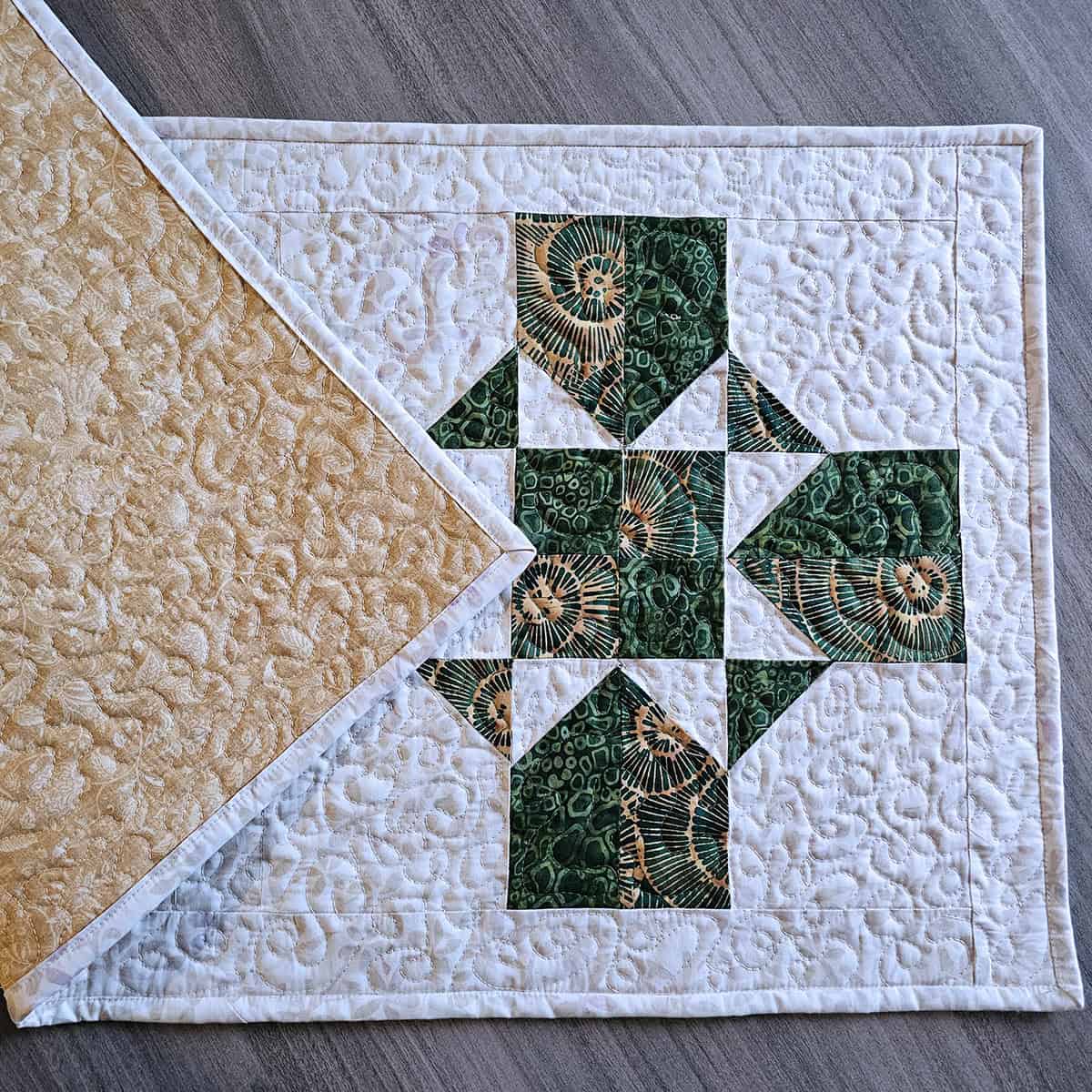
Backing Fabric
Most of the time I save my batiks for the front of my quilts and use regular quilt fabric for the back. I have even been known (many times) to mix batiks with regular quilt fabric on the front. It works.
Not Much Contrast
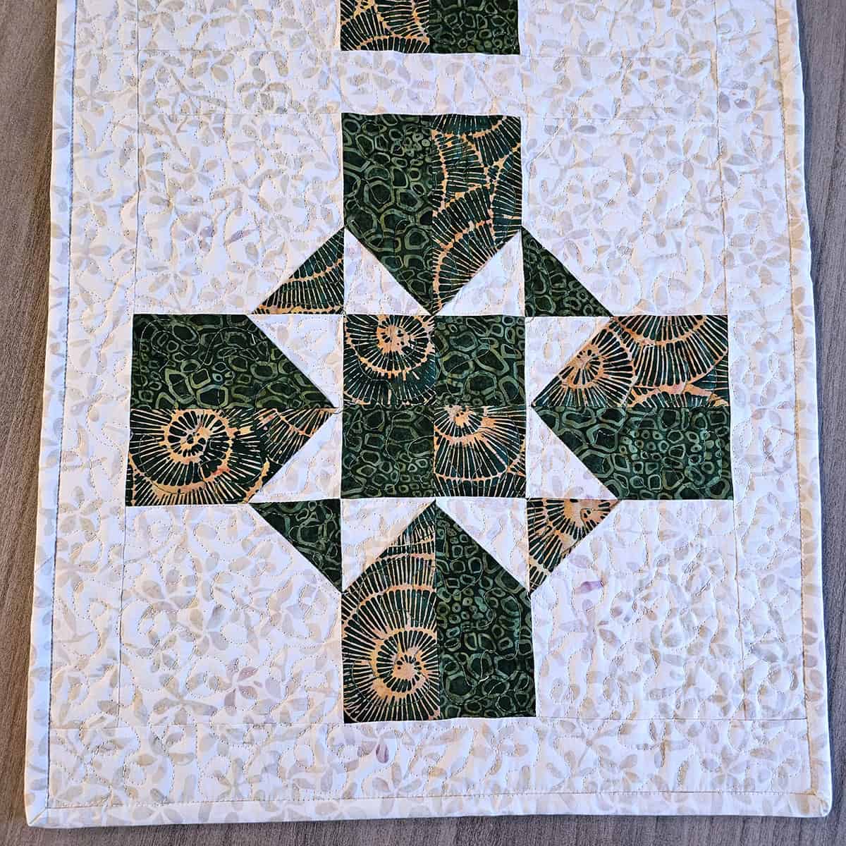
Another thing I’m not crazy about is that there isn’t enough contrast between the 2 green batiks. When you actually see it, the contrast is a little better.
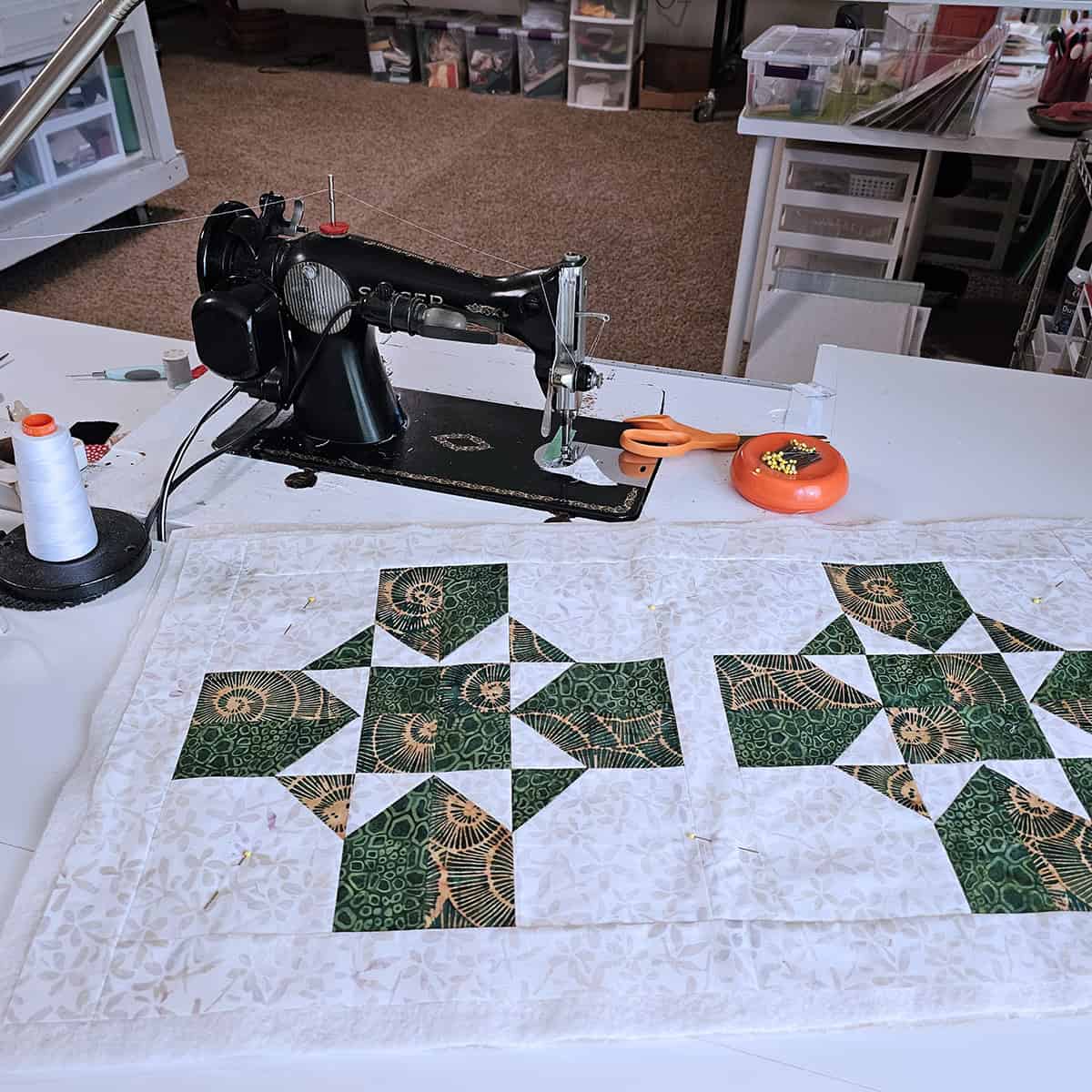
Quilting on the 15-91 Singer
I know I just bought a new longarm but I did quilt this on my vintage 15-91 Singer. In the amount of time it would take to load this on the longarm, warm up my machine for 5 minutes and then thread the machine…..I was able to do all the quilting on my 15-91. Big quilts are what the longarm is for.
Which Would You Pick?
Here is a view of the table runner with the binding matching the background and another with a dark green binding. Which do you prefer?
#14 Happenings
If you would like a closer look at the fabrics take a look at my #14 Happenings post and also see what else I’m making with this quilt block.
Learn How to Make the Quilt Block
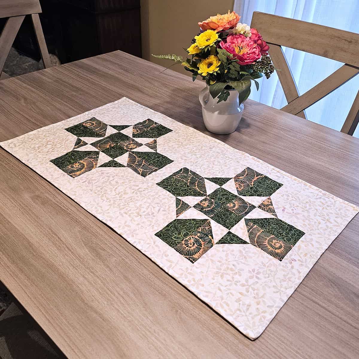
I couldn’t resist showing another watercolor image!
You can find the tutorial here.
Please note this post contains affiliate links, which means I’ll earn a small commission if you purchase through my link at no extra cost to you. Please see full disclosure here. As an Amazon Associate, I earn from qualifying purchases.
Great deals for you!
Looking for great buys on fabric and things? Check out these links
- Fat Quarter Shop Daily Deals
- Green Fairy Quilts – Daily Deals
- AccuQuilt Deals and current offers
- Connecting Threads
- The Quilt Keeper
- SewingMachinesPlus
- Electric Quilt
- My Amazon Store for all the quilting things I use and more

About Connie
Hi, I’m Connie Kresin Campbell, the quilter, writer, and photographer behind Freemotion By the River. I enjoy inspiring others with my quilt tutorials and patterns. You’ll also see my sweet adopted dogs from time to time.
Be sure and subscribe to my newsletter for more free tutorials and printables.
I love the dark green binding the best. It sets it off more.
I think that the greens you choose for the blocks are perfect together. Love it!!
Hi Connie
I love the green binding it makes the design really pop.
All the best
Lilly from The Uk 🇬🇧
Hi, Connie-
Yikes….I am really not one to be giving advice to you, as I usually adore anything you do. I do agree that there might be not enough contrast in the first pics of your runner. I just did that myself and am still getting over it! At that point, I began to think that I wished there was a little less white. The white spaces just seem so huge. I thought maybe another ‘piece’ of something (a smaller square, maybe) of color might help. Then I saw the runner with two different bindings…hmmm….kinda sterile, maybe? Then I scrolled down further, saw the blue/white runner and shrieked with excitement! Lovely…you seemed to have dropped the white border, maybe it’s there, but the print fabric fixed everything…I think you solved your problem!!!! This runner is absolutely beautiful! The only thing missing is our little Rusty sitting nearby, and don’t forget kitty! These thoughts sent with love,
Peggie Riccio
Fremont, NH
LOL, thanks Peggie, I’m with you and the navy blue runner is my favorite and would you believe the fabrics are at least 20 years old from my stash! Don’t worry, Rusty and Puff will be “on” plenty of my quilts in the future.
I prefer the dark binding.
Hi Connie,
It has been a long time since I have been able to look at your creations…working lots of overtime has cut back on my crafty time, unfortunately. This an interesting table runner! The one you made with the binding the same as the background is pretty, makes the blocks stand out. That said, i am a contrast person and I love the contrast of the dark binding against the light! They are both lovely though.
I also agree that quilting on your Singer is faster than setting up your longarm for small projects! I often use my singer 201 for the same reason..and the fact that I love that machine, it is such a work horse and the stitches are lovely. I have many sewing machines that I use, but tend to gravitate towards the vintage machines.
I also love the coolness of fall, I am sitting here listening to a thunderstorm, it is so soothing! Planning my next project!
Have a great day,
Danielle
Hi Danielle, thank you for taking the time to leave me a comment. Like you I love my older machines and have 2 of the 15-91s. I can sew through anything. When the overtime gets done you’ll have time to sew and craft, I love fall also and we have had thunderstorms all night, love hearing the rain. I just wish Rusty wasn’t scared. Take care.
Hi Connie, I like the runner with the dark binding. To me a dark binding just finishes it. I like your long table runner with no sashing. Thank you for sharing your talents with us quilters. 😊
All your stuff is gorgeous, but, hands down, the green binding is my favorite! I see the border and binding as a frame around a piece of art, and the green binding does that!!!
I love the dark binding!
me, too!!!!
In response to your question about which of your bindings your readers like, I prefer the green binding on the table runner, it gives it a proper finished edge.
Charlene Cairn
Green binding for sure!
I really like the darker binding.
Definitely the green binding.
I like the contrasting binding. But either way very pretty.
Useful black that can be used several ways including runners, quilt blocks. I am pleased that I found this block.
I like both of those runners but after seeing the green binding I think I like it a little more than the one with the same binding as the border. I do like the green . It looks great.
Sandra
Beautiful work! Hope you’re feeling much better Connie.
I like the white one .the green blocks Judt pop
I like the one with the green binding. It sets the whole pattern off.
Nice pattern.
Agree, the green binding makes the table runner look nice!
I like your beige backing for the front Earth Essence & take one of the green pie. Sendces to replace it ; would really elaborate. That’s a pretty runner, yea f or 15/91, love your quilting. Send your cool weather to the heart of Texas to replace 100 + . Stay well
Hi, Connie!
My preference is the green so it frames and finishes the runner.
Thanks for sharing.
I think it looks great just as it is.
Hi Connie, I like the dark green binding. It pops the pattern. Great design.
Love the dark binding !
Very cute, I do prefer the green binding as it sets the blocks of better I think.
I have to agree with others that the dark binding makes the pattern really pop against the light background. Very pretty pattern.
The finished runner is beautiful, but I think that the green ties it all together better for a finished look.
Connie , I like the green binding the best. It makes the beautiful table runner pop.
Thanks Barb, seems like it is the winner.
I hate to say it but I almost always choose a darker binding, I just thinks it makes me think that it is finished!! ..but your light binding is a change and changes are usually done for a reason!! Great job!!
My vote goes to the dark green binding. To me the binding frames your work. It puts closure to your piece.
I prefer the runner with the green binding and the contrast.
Love that dark binding with the light border Light binding would work nicely with a dark border. I like my binding to say “here’s the boundaries “. I also love working with this block.
I liked the light binding . . .
UNTIL I saw the dark binding! The light binding is pretty,
the dark binding makes a STATEMENT!
I love that block!
Why can’t we just get a pattern ?
There is a tutorial and I will probably write a complete pattern when I finish the next quilt project.
I like the dark binding. Actually brings out the dark fabric in the middle of the table runner.
I like the dark binding. Makes the table runner stand out more. Actually brings out the dark fabric in the middle of the table runner.
I like the binding matching the background.because it is small.
I think I prefer the dark binding, it gives a finished frame to your piece. But I have to disagree with your issue of not enough contrast between the green pieces. I think the subtlety actually works better to highlight the beauty of the actual pattern, which to me is the star of the piece. It’s a lovely table runner!
Hi Connie
I just love the colors you used. It’s very pretty.
Cindy
I prefer the dark binding. It seems to ” bring it together” better. Glad you’re having good weather. It is 97 here in Jacksonville. AR
I’m with you Janice, 97….ugh I’m over summer!
I’m no help. I like both bindings. It will depend on what look you are going for. The light binding makes the runner softer. But the green binding sharpens everything up.
Thanks Linda
I think I like the dark green binding best. It brings out the colors in the runner.
I agree with you. I’m not fond of light bindings anyway, and the dark one looks more polished and elegant. Beautiful runner, Connie!
Thanks Leslie
I like the darker binding. It really makes the colors in the center pop. Both are very nice but I would have put the darker one on if I were doing it. Just my opinion, though. Great work on both!! Rosalie
Most everyone likes the dark binding, I should have known better.
Connie, a lovely project. I prefer the green binding, too late, I know. Thanks for sharing
Beautiful. Love the watercolor pictures.
Your table runner is absolutely gorgeous. I love it! As for the binding you can always take it off and replace with what you’d prefer. Personally I like the green binding better, makes all the colors pop.
I’m glad the weather is cooling down I’m a sweats kinda gal. Lol
I like the green binding too.
I might have to do that Deborah, I’m a sweats gal too!
Looks like the dark binding is the winner. Lol